24/04/2023
The TRAPEZE Privacy Dashboard – New User Interface, New Opportunities
In our previous blogpost [/the-trapeze-dashboard-control-what-data-is-processed-for-which-purposes/], we highlighted that implementing user interfaces for consent management is complex in practice. This is often hard to believe as the goals we as users pursue are often straightforward:
• “I want to see to whom I gave my consent to process my data. Where and how can I do that?”,
• “I want to contact those who process my data. How can I contact them?”, or
• “I do not want my data to be processed anymore. How can I make it stop?”
The TRAPEZE privacy dashboard aims to make it easy for users to address these goals. In this blog post, we highlight three key insights on designing good user interfaces for consent management.

Bored of reading? Try out the TRAPEZE privacy dashboard hands-on at https://dashboard.trapeze-project.eu.
- Use very (!) little text
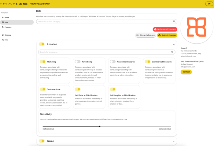
This is the most important insight. Previously, we provided detailed instructions on how to use the dashboard, much like you would encounter in the manual of a newly purchased cooking device or television. Our user tests showed that detailed instructions (even through video or an interactive tour on the website) were not unanimously well-received. Bottom line: Users wanted to ‘start clicking’. They wanted to be onboarded while interacting with the dashboard. We shrunk all texts on the dashboard and, where possible, only used headlines without any accompanying text to indicate what could be, and was expected to be, done on the dashboard. - Make clear what to do
Most users did not know that withdrawing consent forces controllers to delete all their data and cease all processing. Withdrawing consent is thus more rigorous than requesting the deletion of your data. For the design of interfaces, users should understand that there is one action that enables and one action that disables the processing of their data. Users, however, do not come to the dashboard to ‘withdraw consent with the controllers to whom I have previously given consent’. They come to the dashboard to ‘stop the processing of their data’. As withdrawing consent is the most rigorous action that users can take to stop processing their data, the dashboard thus communicates ‘giving’ and ‘withdrawing’ consent as the two main actions to perform.1) We separated these two main actions from side actions that allowed users to explore, delete, or rectify their data. Not every user is a data scientist! We also removed somewhat gimmicky features that distracted users from these two main actions. We thus streamlined the consent-giving and withdrawing workflows that users should, and hopefully will, pursue on the dashboard. - Consent is something that links a data category to a purpose
The new user interface design emphasises the giving and withdrawing of consent. But what should a consent-giving and withdrawing user interface look like? From a legal point of view, consent is pretty complex. For instance, consent-giving must include information on the circumstances under which consent is given. Is consent given by clicking a button? Is consent given by a child? Is consent informed? Is consent given through a ‘clear affirmative action’? These are primarily legal aspects. User and usability aspects are of a different nature. Our user tests indicate that users understand that consent is ‘something that links a data category to a purpose’. We were happy to learn that we found something that most users could quickly pick up through the design of our user interface. While there is much more to consent than merely a purpose and data category, users are already able to give and withdraw consent on the dashboard when prompted with this minimum amount of information. Additional information is available on the dashboard, yet only presented when a user drills down the interface by clicking on ‘see more’ elements. After all, not every user is interested in additional information and is sometimes even overwhelmed by it.
To put it in a nutshell, the TRAPEZE privacy dashboard provides a user interface that allows users to give and withdraw their consent. While many legal and technical aspects foresee that users need to have access to detailed information on what, how, where, and why their data are to be processed when they give and withdraw consent, our user tests indicate that too much information is counterproductive. Reducing the amount of information users face when asked to give or withdraw consent on the dashboard eases onboarding and users are not overwhelmed with information. In other words, the difficulty of designing user interfaces for consent management comes down to a prioritisation of what information should be presented first and what information should be presented later.2) Our findings indicate that users should first be given the purpose and the data that are to be processed before any other information.
Any comments, questions, or feedback? Feel free to contact us.
1) Note that consent is not the only legal basis on which controllers process personal data. If you buy a product online, the online shop does not need your consent. Fulfilment of the purchase contract requires the processing of your address for delivery. Here, users may limit the processing of their address by not purchasing a product or altering the purchase contract by, for instance, using an alias delivery address or picking up the product at a brick-and-mortar store (click-and-collect).
2) This design principle is often called ‘layered interface’.
Contact:
Philip Raschke, philip.raschke@tu-berlin.de
Tobias Eichinger, tobias.eichinger@tu-berlin.de
Related information:
Dynamic consent mechanisms – Second version (D4.5) 30 APR 2023
This deliverable focuses on consent management on the privacy dashboard. A prototype version of the privacy dashboard was used in the first usability test.
Privacy dashboards – Second version (D4.7) 30 JUN 2023
This deliverable reports on the TRAPEZE privacy dashboard, a web application that establishes both transparency and control. Transparency features include data exploration that allows users to display the data usage and potential risks associated with processing. Control features include consent management and incident reporting to limit data usage. The privacy dashboard is generally considered a personal data processing limitation dashboard.

